Process Post #5
Q: Please pick a website of your choosing and describe what works or doesn’t work.

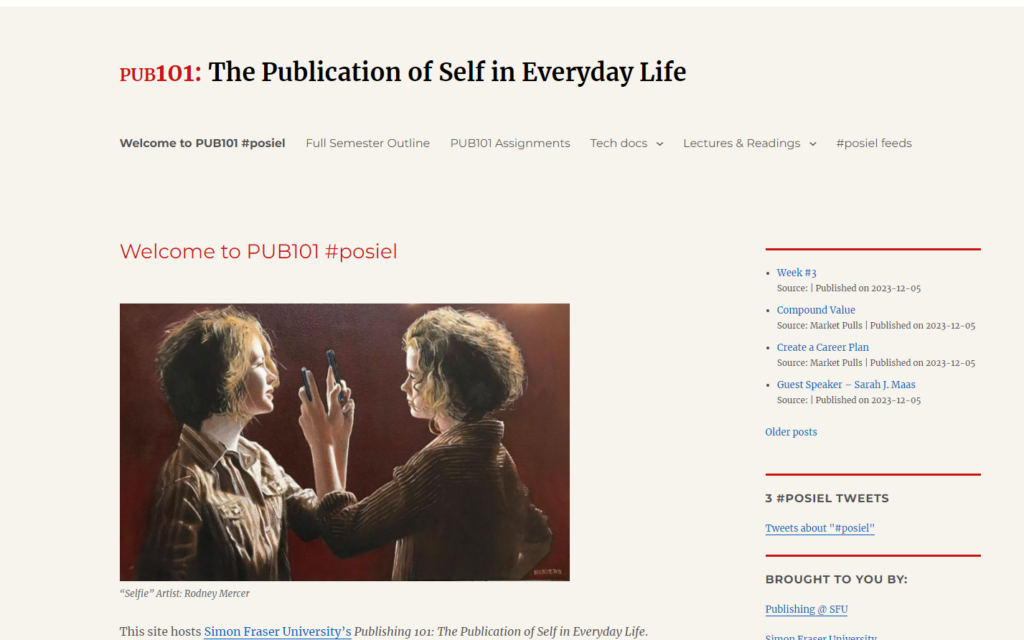
Maybe this is a blasphemous choice but I decided to choose posiel.com.
Overall, I think that it does what’s necessary to fulfill its objective, which is being an informative hub of information to students taking PUB101. The colour scheme is neutral with an effective subtle touch of red and blue. The menu is clear and easy to navigate. The feed addition lets you peruse the student’s tagged content. In a way, the beige undertone sets an academic mood and is incredibly suitable.
Despite the easy navigation, one problem I found myself running into consistently was the sheer length of the course outline page. I found that a very long single page that utilizes largely one size of text makes it less accessible to read. It feels at time ike a block wall of text and I think it would be great if there was an alternative way to view the course outline, more clearly categorized by week.
